网页设计中的点滴细节把握(3)
文章来源于 Zhouwenqi,感谢作者 佚名 给我们带来经精彩的文章!设计教程/前端设计/前端设计2010-09-01
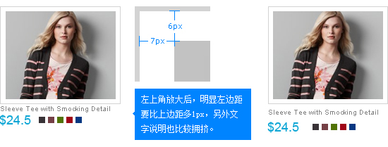
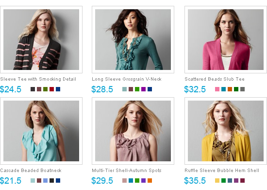
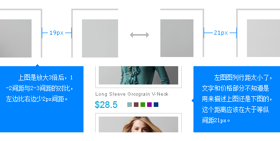
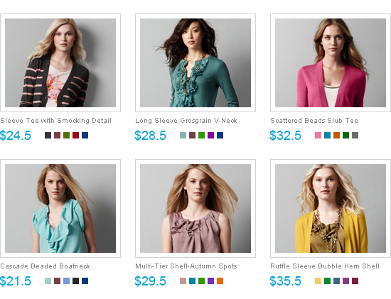
在看下面的例子: 上图中区块上下间距与左右间距不匀称,和前几的列子一样,文字与区块上下垂直间距不协调,下图是修正后的结果。 在来看一组给图片加框的效果: 在来看图列间距: 下面这个列图看似没问题,其实有


 情非得已
情非得已
推荐文章
-
 21个Sketch实用高频小技巧2019-02-15
-
 25款值得收藏的优秀网站模板免费下载2015-09-16
-
 20套高质量的免费网页模版PSD素材2013-09-02
-
 20款国外时尚大气的按钮开关PSD素材下载2013-07-31
-
 CSS实例教程:十步学会用CSS建站2011-10-05
-
 网页设计师:浅淡网页BANNER设计2010-09-27
-
 网页细节教程:WEB设计精确点滴2010-09-13
-
 网页设计中的点滴细节把握2010-09-01
-
 总结交互组件创新的四种方式2010-06-28
-
 最全的国外电子商务CSS模板下载2010-06-18
热门文章
-
 5个网站设计实例解析网页设计趋势
相关文章4452018-11-29
5个网站设计实例解析网页设计趋势
相关文章4452018-11-29
-
 实例分析9款惊艳的网页设计作品
相关文章5142018-10-10
实例分析9款惊艳的网页设计作品
相关文章5142018-10-10
-
 10种网页设计中字体的运用方式
相关文章3472018-05-10
10种网页设计中字体的运用方式
相关文章3472018-05-10
-
 优秀的网页设计和开发资源干货集合
相关文章5102018-05-10
优秀的网页设计和开发资源干货集合
相关文章5102018-05-10
-
 精选5月最流行的网页设计趋势
相关文章4832018-05-10
精选5月最流行的网页设计趋势
相关文章4832018-05-10
-
 详细解析10个2018年网页设计趋势
相关文章5182017-12-17
详细解析10个2018年网页设计趋势
相关文章5182017-12-17
-
 设计师须知的已过时的网页设计趋势
相关文章3012017-12-11
设计师须知的已过时的网页设计趋势
相关文章3012017-12-11
-
 神秘的黑色主题网页设计配色技巧
相关文章4112017-11-17
神秘的黑色主题网页设计配色技巧
相关文章4112017-11-17
